


StatCounter (2024) reports that mobile devices now account for approximately 55-60% of global web traffic, highlighting that more than half of all internet users primarily access websites through mobile devices. Given this shift, optimizing navigation for small screens is essential for delivering a seamless and enjoyable user experience.
A well-crafted mobile navbar not only facilitates effortless navigation but also enhances the overall usability and aesthetics of your site. In this blog post, we’ll showcase inspiring mobile navbar designs and share best practices for creating an effective navigation experience on small screens.
Mobile Navbar Types
1. Expandable Hamburger Menu
Characteristics:
- Space-Efficient: The hamburger menu hides the full navigation options behind a small icon, expanding only when needed.
- Icon-Based: Typically represented by three horizontal lines, the hamburger icon is widely recognized by users.
- Smooth Animation: Many designs incorporate smooth transitions or animations to enhance the user experience when the menu expands or collapses.
Inspiration:
Many popular apps and websites, including Airbnb and Instagram, use expandable hamburger menus to efficiently manage space on small screens while providing access to a wide range of options.
Best Practice:
Ensure that your hamburger menu is easily accessible and intuitive. Use animations to make the transition smooth and visually appealing, and consider adding labels to make options clear when the menu is expanded.

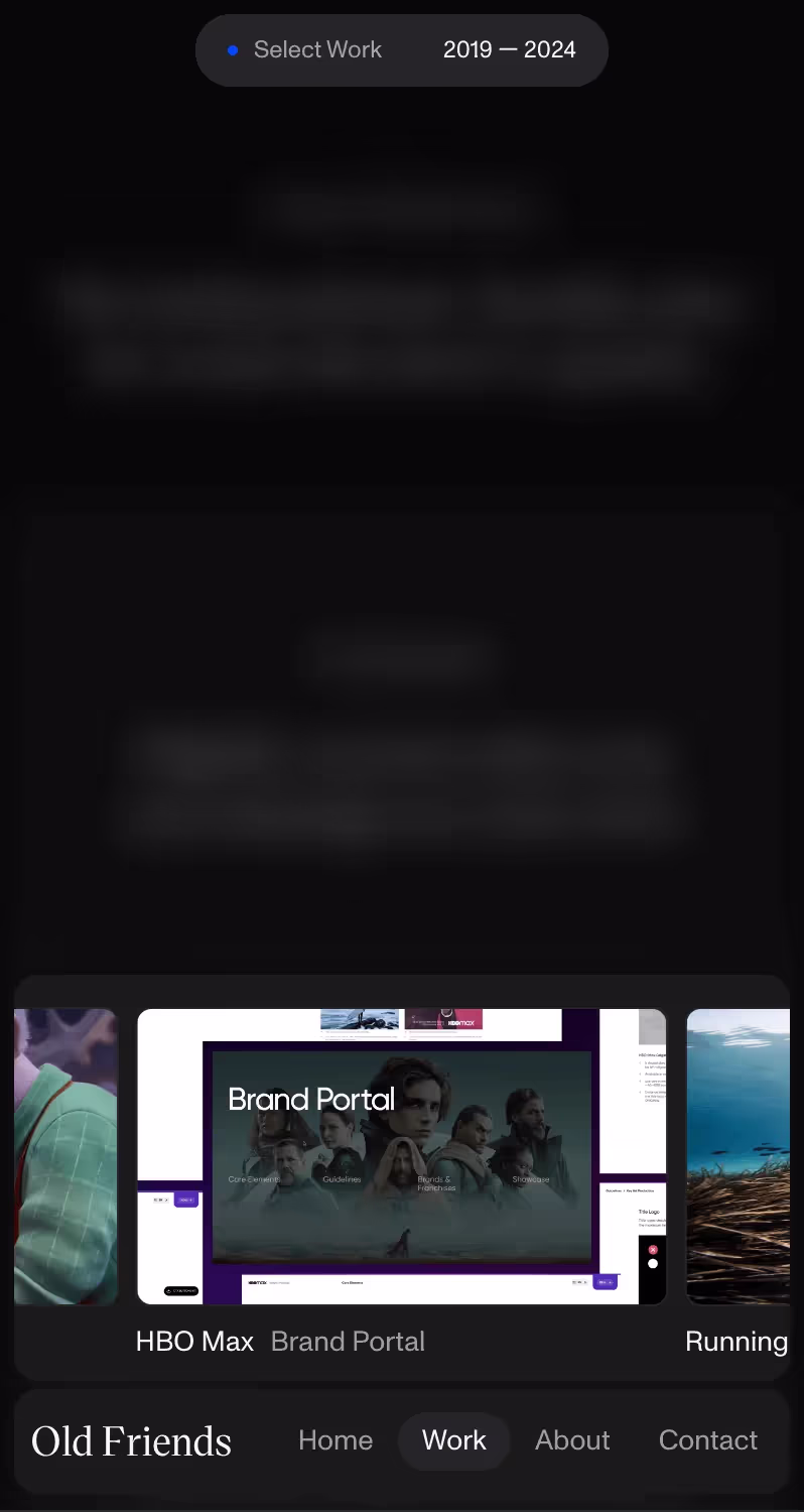
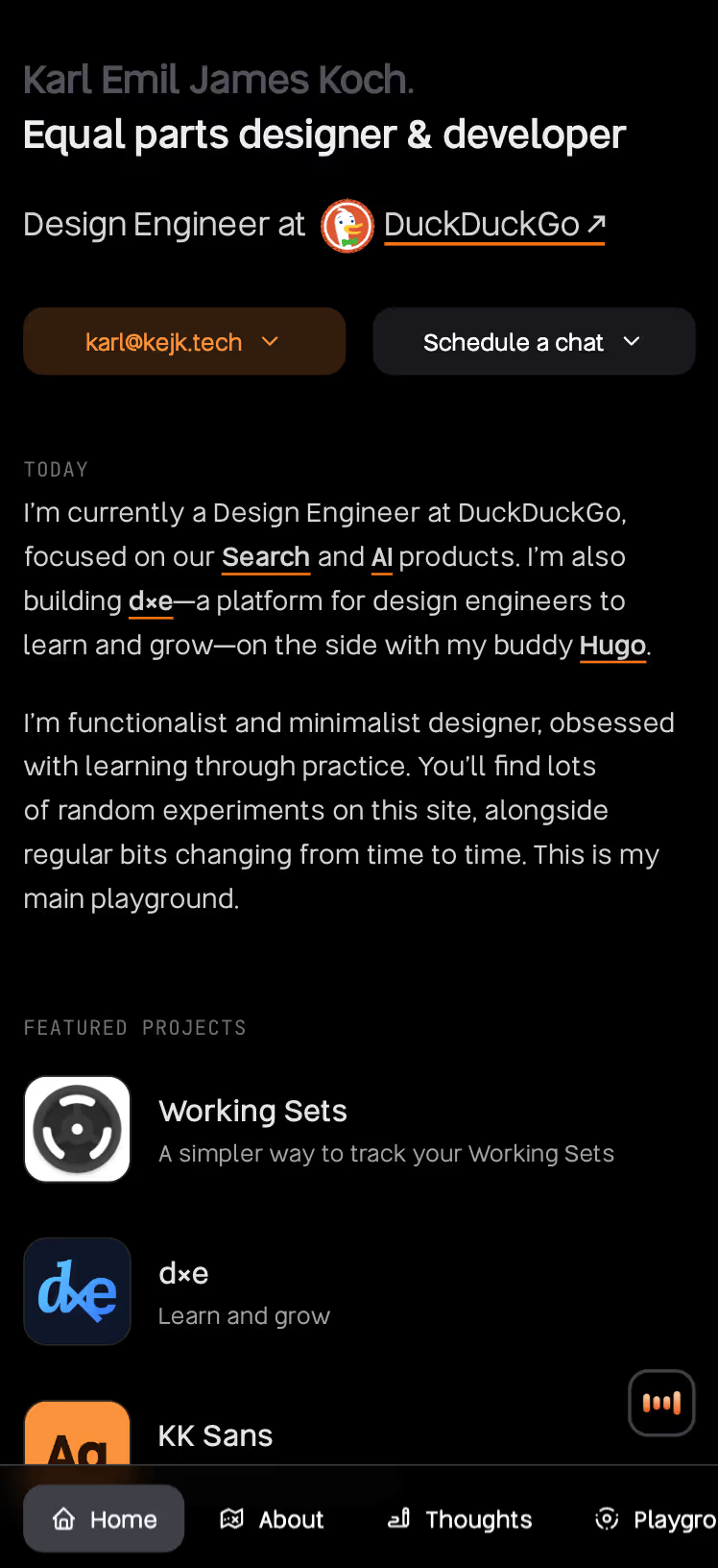
2. Bottom Navigation Bar
Characteristics:
- Thumb-Friendly: Positioned at the bottom of the screen, this navigation style is easily reachable for users holding their phones with one hand.
- Fixed Position: The bar remains fixed at the bottom, providing constant access to primary navigation links.
- Icon and Text: Typically includes a combination of icons and text for clarity and quick access.
Inspiration:
Popular apps like Spotify and Facebook utilize bottom navigation bars to keep essential actions within easy reach, enhancing usability for mobile users.
Best Practice:
Use a bottom navigation bar for primary actions or links that users frequently access. Limit the number of items to four or five to avoid clutter and ensure that the bar remains functional and easy to use.
3. Tab Bar Navigation
Characteristics:
- Organized Tabs: This design uses tabs to categorize different sections or features, allowing users to switch between them easily.
- Visual Indicators: Tabs often include icons and labels to help users quickly identify each section.
- Swipeable Tabs: Some designs incorporate swipe gestures to navigate between tabs, enhancing the user experience.
Inspiration:
Apps like Twitter and Google Maps effectively use tab bar navigation to organize content and features, making it easy for users to switch between different sections.
Best Practice:
Organize tabs based on user priorities and ensure that each tab is clearly labeled. Consider incorporating swipe gestures for an added layer of convenience.
4. Full-Screen Overlay Menu
Characteristics:
- Immersive Experience: The full-screen overlay menu covers the entire screen when activated, providing a focused and distraction-free navigation experience.
- High Visibility: Since the menu takes over the whole screen, it ensures that all navigation options are easily visible and accessible.
- Engaging Design: Often includes high-quality visuals and animations to create an engaging user experience.
Inspiration:
Websites like Airbnb and Netflix use full-screen overlay menus to offer an immersive navigation experience, particularly useful for displaying extensive options or detailed information.
Best Practice:
Design your full-screen overlay menu with high-quality visuals and clear navigation options. Use animations to enhance the user experience and ensure that the menu is easy to dismiss when not needed.

5. Scrollable Navigation
Characteristics:
- Scrollable Lists: Instead of fitting all options on one screen, scrollable navigation allows users to swipe through a list of options.
- Vertical or Horizontal: This can be implemented vertically or horizontally, depending on the design and content.
- Dynamic Content: Often used for dynamic content or categories that are too extensive to fit in a single view.
Inspiration:
Many modern e-commerce sites and apps use scrollable navigation to display product categories or content sections, allowing users to explore more options without overwhelming the initial view.
Best Practice:
Ensure that scrollable navigation is smooth and intuitive. Clearly indicate which items are currently visible and make it easy for users to navigate through the options.
5. Slide-Out Menu
Characteristics:
- Partial Screen Coverage: The slide-out menu, also known as a slide-in menu, slides in from the side of the screen and covers only a portion of the screen's width. This design maintains visibility of the main content while providing access to navigation options.
- Space-Efficient: By using only a portion of the screen, it saves valuable space on smaller devices, allowing users to interact with the content without feeling overwhelmed.
- Trigger Mechanism: Typically activated by a hamburger icon, a menu button, or a swipe gesture, the slide-out menu provides a smooth and intuitive way to reveal additional navigation options.
Inspiration:
Popular apps and websites like Twitter and Facebook use slide-out menus to offer a space-efficient solution for accessing extensive navigation options. This design keeps the main content area uncluttered while still offering users easy access to additional features and sections.
Best Practice:
Design your slide-out menu with clear labels and a logical structure to ensure users can find what they need quickly. Ensure that the menu slides in smoothly and is easy to dismiss, maintaining a seamless user experience. Consider adding subtle animations to enhance the interaction and make the menu feel integrated with the overall design.
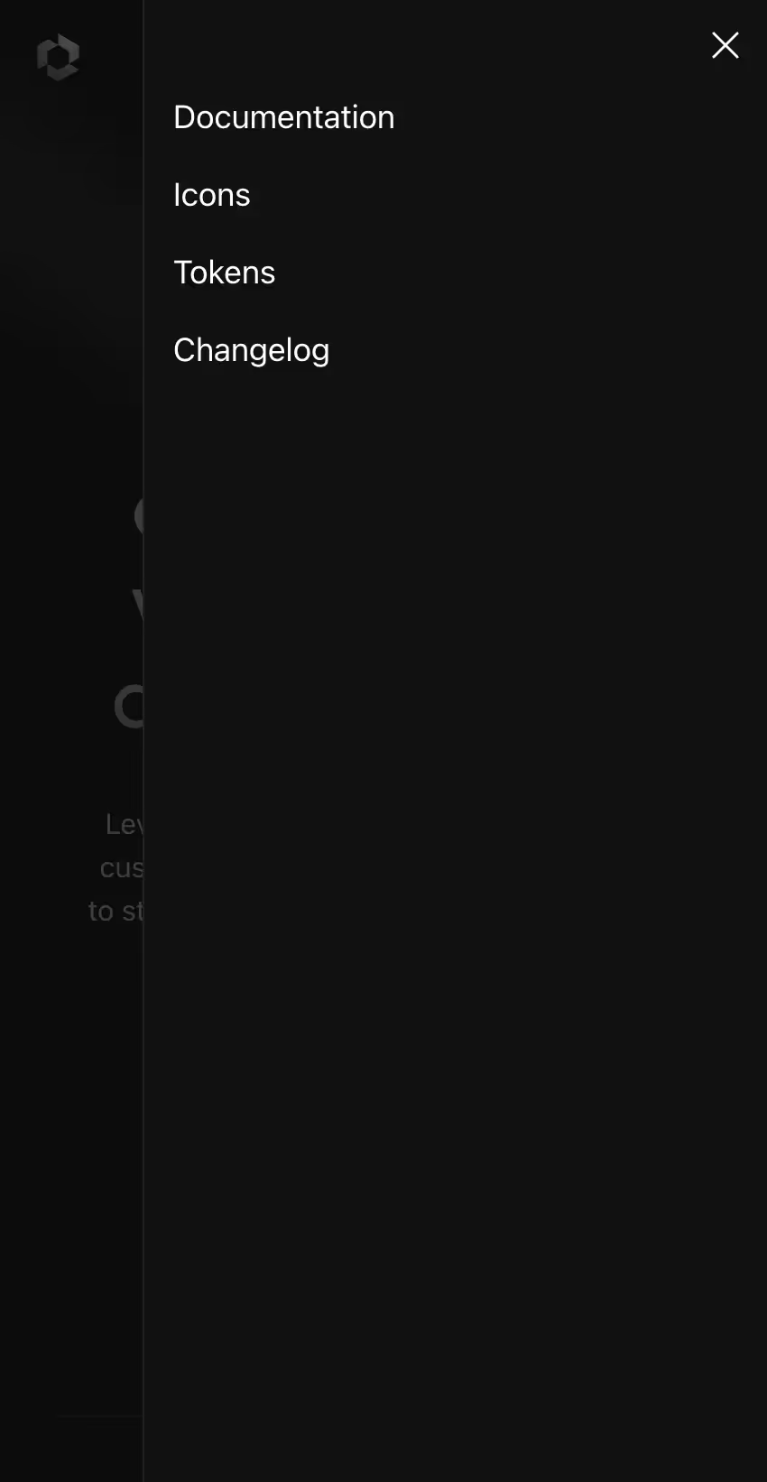
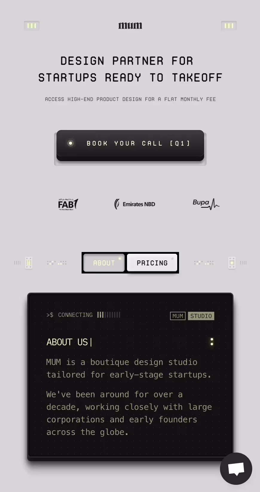
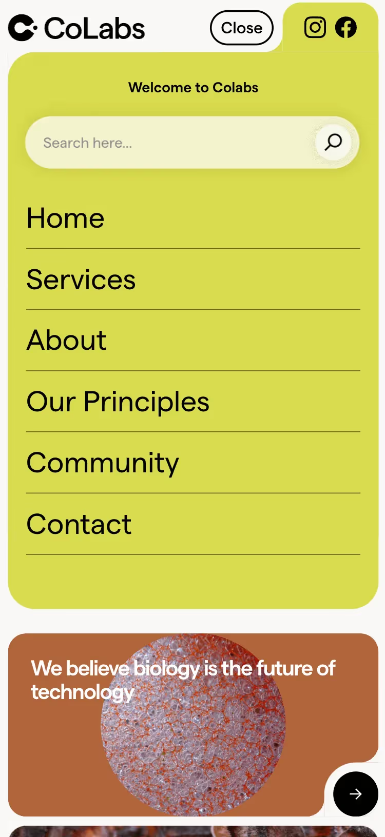
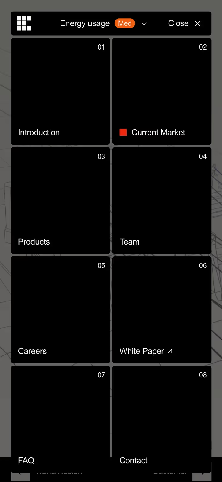
Creative Mobile Navbar Designs
Here are some designs to inspire you in creating a beautiful and functional mobile navigation bar.

If you would like to see more examples of beautiful mobile navigations, head over to our Mobile navigation bar collection page.
Conclusion
Designing an effective mobile navbar requires a balance between functionality and aesthetics. By drawing inspiration from successful designs and adhering to best practices, you can create a navigation experience that enhances usability and accessibility on small screens. Whether you opt for a minimalist design, expandable hamburger menu, bottom navigation bar, or any other style, ensure that your mobile navbar meets the needs of your users and aligns with your overall design goals.

.png)