


Dropdown navigation is one of the most common patterns on the web, and also one of the most misused. When done well, a dropdown extends your navbar without crowding it, reveals content at exactly the right moment, and makes a complex site feel instantly navigable. When done poorly, it becomes a frustrating hover trap that opens at the wrong time, closes before you reach it, or dumps a wall of unstyled links onto the page.
This post rounds up the best dropdown navigation bar designs from real websites, with a breakdown of what makes each one worth studying. It also covers the design decisions, interaction patterns, and technical details that separate the dropdowns people actually enjoy using from the ones they work around.
What Is a Dropdown Navigation?
A dropdown is a secondary navigation panel that appears below a trigger link in the navbar, revealing additional pages, categories, or features on demand. Unlike a mega menu, which typically spans a wide panel with multiple columns and rich content, a standard dropdown is more focused: a smaller set of links, organized for quick access, that disappears when the user moves on.

Dropdowns come in several distinct flavors. Some are simple vertical lists. Others use a grid layout, split columns, or card-based designs to add visual structure. Some open on hover, others on click. Some slide in with animation, others just appear. Each approach suits different contexts, and the examples below cover a wide range of them.
When to Use a Dropdown
Dropdowns work best when:
- A top-level nav item has between 3 and 8 sub-destinations
- The linked pages fall into a natural group that benefits from being visible together
- You want to avoid navigating the user to an intermediate category page
- The content doesn't justify a full mega menu but is too much for a single link
They start to break down when the list gets too long, when the grouped content is too diverse to scan quickly, or when the site has enough top-level navigation structure that a dropdown adds complexity rather than reducing it.
Best Dropdown Navigation Bar Design Examples
1. ToDesktop
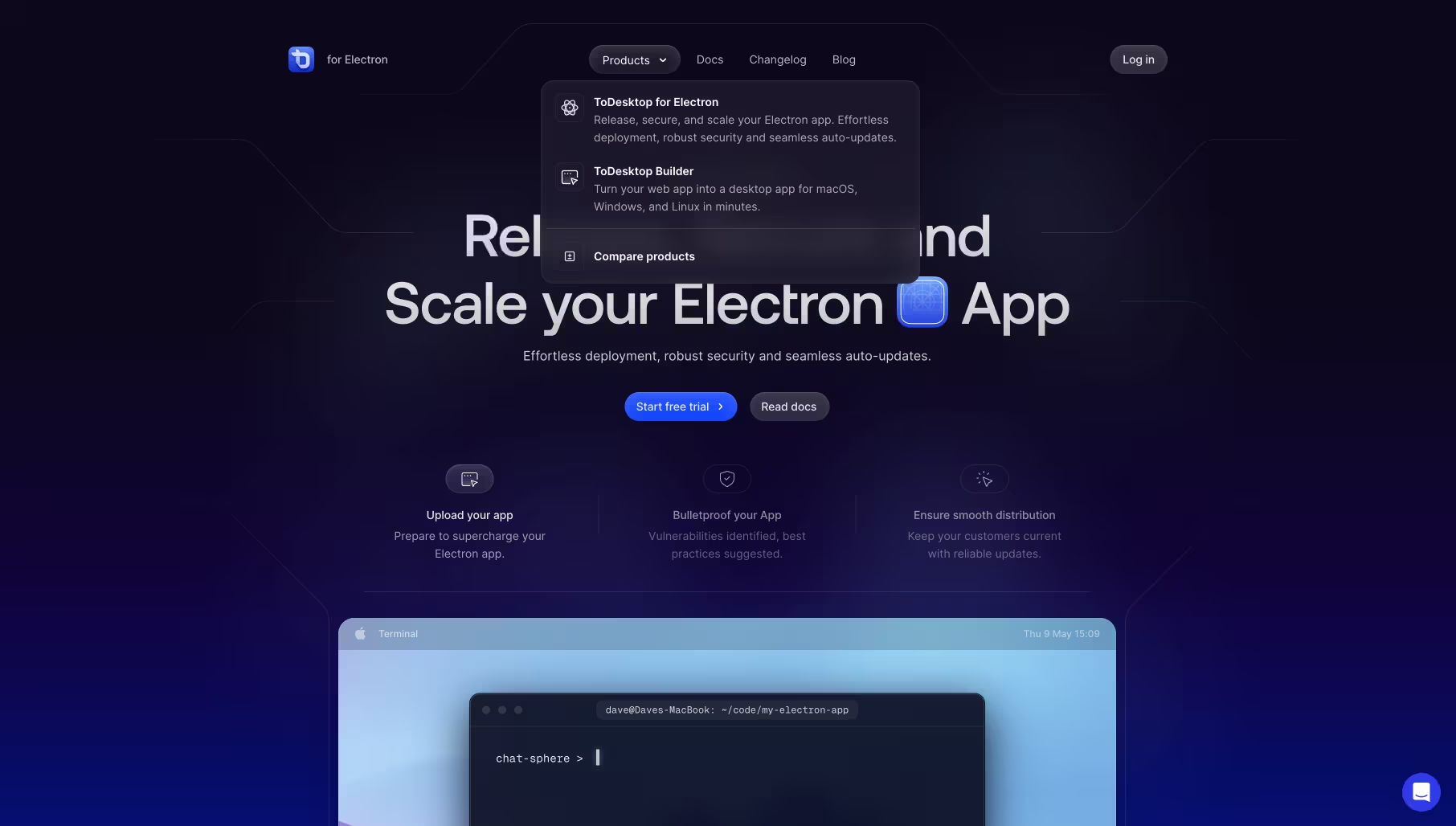
ToDesktop's dropdown is a study in restraint. Against a dark, near-black panel, two product options sit cleanly side by side: ToDesktop for Electron and ToDesktop Builder. Each has a small icon, a bold product name, and two lines of description that tell you exactly what the product does. A "Compare products" link sits at the bottom, separated by a subtle divider. That's the entire dropdown. Nothing more.
What makes it work is how much trust it places in clear copywriting over visual complexity. There are no illustrations, no featured cards, no decorative elements. The dropdown earns its keep purely through information hierarchy and whitespace. For a developer tool where the audience reads carefully before clicking, this is exactly the right call.
What to take from this: sometimes the best dropdown design is the one that gets out of the way. If your product names and descriptions are strong enough to stand on their own, you don't need decoration. Let the copy do the work.
View it on Navbar Gallery: navbar.gallery/navbar/todesktop
2. Visitors
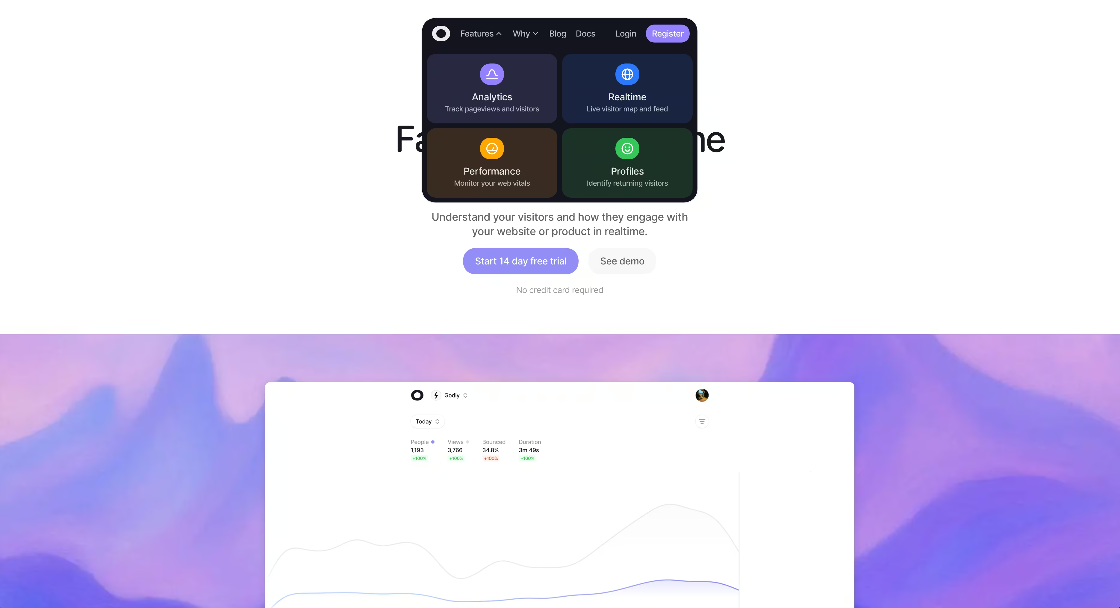
Visitors takes the opposite approach to ToDesktop and it works just as well. The dropdown opens as a 2x2 grid of feature cards, each with a large colored icon, a bold label, and a one-line description. Analytics, Realtime, Performance, Profiles — four destinations, four cards, equal weight. The dark panel uses distinct background colors per card to give each feature its own visual identity without needing separate branding.
The grid format does something a vertical list can't: it communicates that all four features are equally important, none is a secondary option. That's a meaningful product signal. Users reading the nav instantly understand they're choosing between parallel features rather than navigating a hierarchy.
What to take from this: grid-based dropdowns are underused. When your sub-items are genuinely parallel in importance, a 2x2 or 2x3 grid communicates that parity far better than a ranked list does.
View it on Navbar Gallery: navbar.gallery/navbar/visitors
3. Mockuuups Studio
Mockuuups Studio uses a split-panel dropdown that's worth paying attention to for how it handles a category-heavy product. The left side is a clean vertical list of device categories: All Devices, Phooone, Tablet, Laptop, Desktop, Smartwatch, Television. The right side shows a large, contextual product image that updates as you hover over each category.
This pattern — a link list on one side, a visual preview on the other — is borrowed from desktop OS file browsers, and it translates remarkably well to dropdown navigation. The image isn't decorative; it's doing real wayfinding work by showing you exactly what kind of mockup you'll find in each category before you commit to a click.
The animation deserves its own mention. The transition between category previews is smooth and polished in a way that makes hovering through the list feel satisfying rather than functional. This is one of those dropdowns where the interaction itself becomes a part of the product experience.
What to take from this: if your dropdown categories are visually distinct, a live preview panel eliminates ambiguity and adds delight simultaneously. The animation quality signals craft across the whole product.
View it on Navbar Gallery: navbar.gallery/navbar/mockuuups-studio
4. Effortel
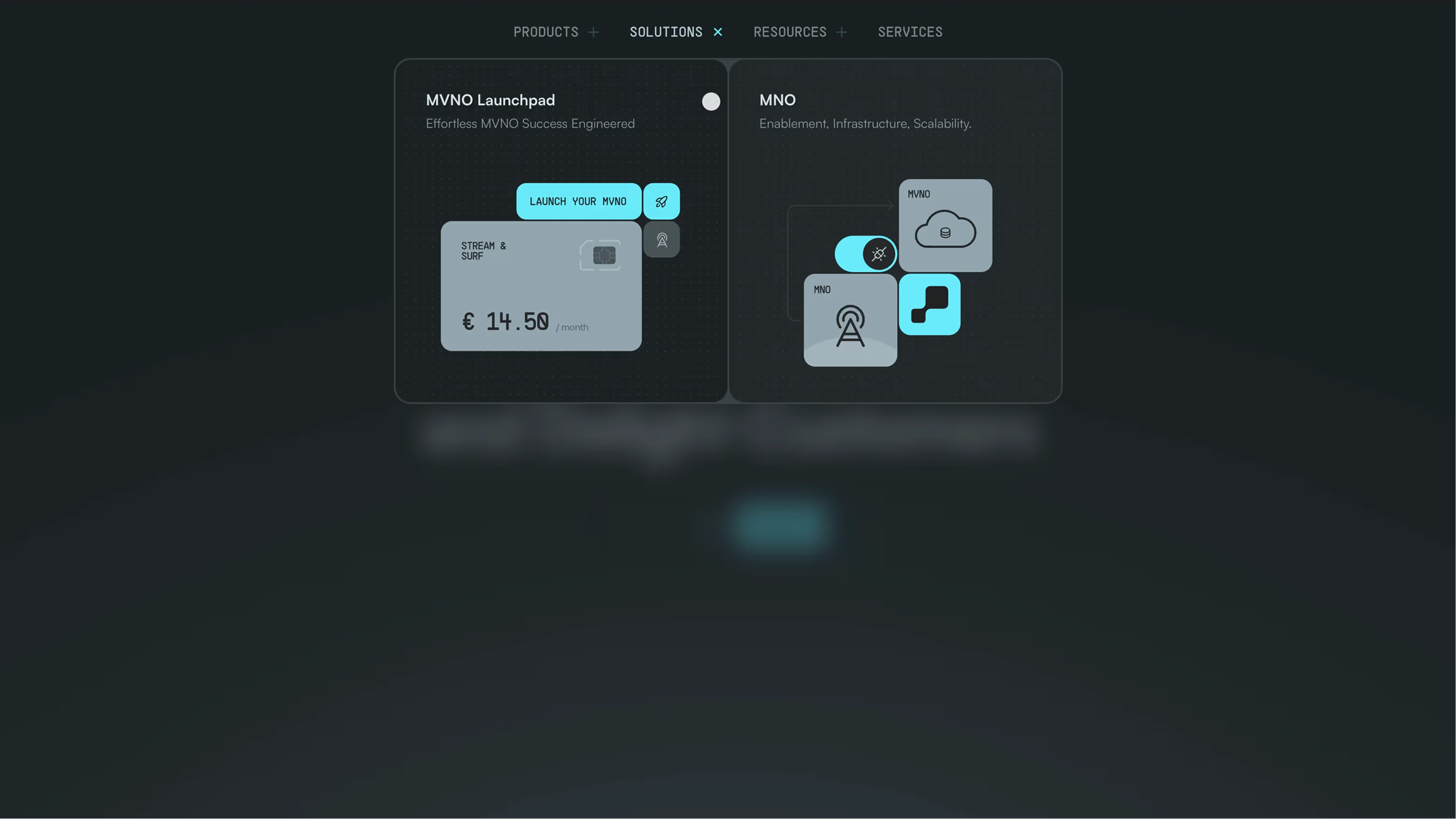
Effortel's dropdown takes the visual product card approach to its logical extreme. The panel opens to reveal two large, equal-width cards side by side: MVNO Launchpad and MNO. Each card has a short title, a one-line descriptor, and a rich illustrated UI preview showing what the product actually looks like. The dark background and teal accent colors give it a technical, sophisticated feel that matches the telecom infrastructure audience this product serves.
There are no lists, no descriptions, no supporting links. Just two cards, each acting as a self-contained entry point into a product area. It's a confident design decision that only works because the two offerings are genuinely distinct and the illustrations are strong enough to communicate that distinction without words.
What to take from this: when you have a small number of products that are visually differentiable, dropping the link list entirely and going card-only is a bold move that can pay off. It forces the design to do the explaining rather than the copy.
View it on Navbar Gallery: navbar.gallery/navbar/effortel
5. Rekorder Studios

Rekorder Studios is on the opposite end of the visual spectrum from Effortel, and it's just as deliberate. The navigation sits in a centered dark pill at the top of the page, with clean uppercase labels and small dot indicators showing the active state. The dropdown that opens beneath HOME is minimal to the point of near-invisibility, a single small element that feels more like a tooltip than a panel.
What's interesting here is how the navigation itself becomes a typographic and compositional element within the overall page design. The centered pill, the monochromatic palette, the contact information floating in the top corners — everything works together as a layout decision, not just a nav decision. The dropdown doesn't break that composition; it fits inside it.
What to take from this: on creative and studio sites where the page itself is the portfolio, navigation should be seen but not heard. The best dropdown for this kind of site is one that barely feels like a dropdown at all.
View it on Navbar Gallery: navbar.gallery/navbar/rekorder-studios
6. Unlearn AI

Unlearn AI's dropdown opens as a full-width overlay panel divided into three bold color-coded columns: Platform in deep purple, Research in teal, Company in dark green. Each column functions as a card with its own heading and a short list of arrow-linked pages beneath. A close button sits in the top left corner. The overall effect is closer to a full-screen menu than a traditional dropdown, but it's triggered from a standard nav link and behaves like a dropdown in terms of interaction.
The color-coding is doing serious work here. Without reading a single word, you understand that Platform, Research, and Company are three genuinely different areas of the site. The visual separation reduces the cognitive effort of parsing the nav considerably. The arrow icons on each link add a subtle directional signal that keeps the design feeling active without being decorative.
What to take from this: using distinct background colors per section inside a dropdown is an underutilized technique. It communicates information architecture visually and instantly, which is especially valuable when your content spans genuinely different domains like product, science, and company.
View it on Navbar Gallery: navbar.gallery/navbar/unlearn-ai
7. Retool

Retool's dropdown is one of the most visually memorable in the collection. The panel splits into two unequal halves: a narrow left column with a "CORE LIBRARY" label and four large-type links (Apps, Workflows, Database, Mobile), and a wide right panel occupied almost entirely by a striking editorial illustration. The illustration changes depending on which link is hovered, with a smooth animated transition between images.
The typography in the left column deserves specific attention. The links are set in a large, bold display size that you don't often see inside a dropdown. Combined with the active state (Apps is highlighted with a left border and brighter weight), the hierarchy is clear and the links are unmissable. The illustration isn't just visual filler — it shifts contextually with hover state, making the entire panel feel interactive and alive.
What to take from this: pairing a minimal link list with a full-bleed illustration panel is one of the most effective ways to make a dropdown feel like a designed surface rather than a utility. When the illustration responds to hover state, you're not just showing content — you're creating a moment of delight that most users will remember.
View it on Navbar Gallery: navbar.gallery/navbar/retool
How to Design a Dropdown Navigation: Tips and Best Practices
The examples above show how varied dropdown design can be. But across all of them, a handful of principles show up consistently in the ones that work.
Keep the trigger and the content tightly related
A dropdown should feel like a direct extension of the nav item that triggered it. If hovering "Products" opens a panel that includes blog posts and case studies, the information architecture is broken. Users build a mental model of what lives where from the nav labels alone. When the dropdown content doesn't match that model, it creates friction and erodes trust in the navigation overall.
Before designing the dropdown, define exactly what category of content it contains and make sure the trigger label accurately names it.
Decide on hover vs. click early and commit
The hover vs. click decision shapes everything downstream: the animation, the delay logic, the mobile behavior, and the accessibility implementation. Hover suits sites where users explore the nav casually and frequently — marketing sites, SaaS landing pages, portfolio sites. Click suits product dashboards, e-commerce stores, and any context where accidental triggering would be disruptive.
For hover-triggered dropdowns, a 100 to 150ms open delay prevents accidental triggers as cursors pass over nav items. A safe triangle interaction — where the panel stays open as the cursor moves diagonally from the trigger into the panel — is essential for dropdowns with any horizontal distance between the trigger and the panel content.
Use the right layout for the right content type
Not all dropdown content is the same, and the layout should reflect that.
A simple vertical list works for a small set of parallel links where there's no need to add visual weight to any single item. A grid layout works when the sub-items are genuinely equal in importance and visually differentiable. A split-panel layout works when you have both links and contextual imagery, or when you need a preview mechanism. A card-based layout works when each item is a product or feature with enough identity to warrant its own visual treatment.
The mistake to avoid is defaulting to a vertical list out of habit when the content would benefit from a different structure.
Animation should feel instant, not theatrical
The goal of a dropdown animation is to reduce the perceived abruptness of the panel appearing — not to entertain. A simple fade-in combined with a subtle downward translate of 4 to 6px is almost always enough. Duration should be between 120ms and 180ms. Anything longer starts to feel like the dropdown is buffering rather than responding.
The one exception is when the animation is part of the product's design language, as with Retool and Mockuuups Studio, where the transition between hover states is a deliberate design moment. Even then, individual transitions are fast — it's the quality and smoothness that make them memorable, not the duration.
Typography inside dropdowns is underrated
Dropdown links are often set in a default body size with no particular typographic consideration. The Retool example shows what's possible when you treat dropdown typography as a design decision rather than an afterthought. Large, well-set link text inside a dropdown is both more readable and more visually impressive than the standard approach.
At minimum, establish a clear two-level type hierarchy inside your dropdown: a label or category heading, and the links beneath it. Use weight, size, and color contrast to make the hierarchy obvious without relying on dividers or boxes.
Dropdown accessibility checklist
Accessibility is where dropdown implementations most commonly fall short. The core requirements are:
- The trigger element should use
aria-expandedto communicate open/closed state to screen readers - When the dropdown opens, focus should move into the panel
- Every link inside the panel must be reachable by keyboard via Tab
- Pressing Escape should close the panel and return focus to the trigger
- On touch devices, dropdowns should open on tap, not hover
None of these require complex JavaScript if you plan for them from the start. The ARIA Authoring Practices Guide has a detailed disclosure navigation pattern that covers all of these cases and is worth reading before implementation.
The mobile problem

Dropdowns are a desktop pattern and need a separate strategy on mobile. A hover-triggered dropdown simply doesn't exist on touch screens, and a tap-triggered dropdown inside a hamburger menu structure can feel like an unnecessary extra layer of navigation.
The cleanest mobile approach is to flatten the dropdown content into the expanded mobile menu as a labeled section, making all sub-links directly visible without requiring a second tap. This is the same organizational logic as the dropdown — grouped, labeled content — just presented linearly rather than as a revealed panel.
Common Dropdown Design Mistakes
A few patterns come up consistently in dropdown implementations that undermine otherwise solid designs.
- Opening instantly on hover. A zero-delay hover trigger will open the dropdown constantly as the cursor passes through the nav area. A 100 to 150ms delay is almost always worth adding.
- No safe triangle. Without a safe triangle implementation, the dropdown closes the moment the cursor leaves the trigger element, making it impossible to reach dropdown items that aren't directly below the trigger.
- Inconsistent close behavior. Dropdowns should close when the user clicks outside, tabs out, or presses Escape. Implementations that only close on a second hover of the trigger create confusing stuck states.
- Too many items. Once a dropdown exceeds 8 to 10 items, it starts to become a problem of information architecture, not design. The solution is usually to either introduce grouping labels, break into a mega menu, or reconsider the navigation structure entirely.
- Forgetting focus states. Every link inside a dropdown needs a visible focus state for keyboard users. Default browser focus outlines are a fine starting point, but custom focus styles that match the dropdown's visual language look more intentional.
What These Examples Have in Common
The dropdowns in this roundup range from a two-item dark panel to a full-width color-coded overlay, and they look almost nothing alike. But all of them share the same underlying quality: they feel considered. Every layout choice, every piece of copy, every animation reflects a decision made by a designer who understood what the dropdown was for and who was going to use it. That's the standard worth aiming for. A dropdown is a small surface area with a lot of contact with your users. It's worth the same level of attention as any other part of the design.

.png)