


Static navigation gets less attention than mega menus and dropdowns, and that's exactly why it's worth studying carefully. There are no expanding panels, no hover states revealing nested content, no complex interaction logic to design around. Just a navbar, its links, and the decisions a designer makes about how to present them. Those decisions turn out to matter more than most people realize.
A static navbar strips the navigation down to its essentials. What you include, how you position it, what typographic treatment you give it, whether it floats over content or anchors to the top of the page — all of these choices are visible all the time, with nothing to hide behind. The best static navbars are the ones that look inevitable, like the only possible design for the site they live on. This post rounds up the best examples of that, with a breakdown of what makes each one work and a guide to the design principles behind them.

What Is a Static Navigation Bar?
A static navbar is a navigation bar with no dropdowns, no expanding panels, and no secondary menus. Every destination is visible at once, laid out as a flat list of links. It's the oldest and most common form of navigation on the web, and in many ways the hardest to make interesting.
Static navbars are sometimes also called "flat navbars" or "simple navbars." They're distinct from sticky navbars in that a sticky navbar follows the user as they scroll, while a static one stays fixed at the top of the page. Though the two are often combined — a static layout that also happens to be sticky — they're separate design decisions.

When to Use a Static Navbar
Static navbars work best when:
- Your site has five or fewer primary destinations
- Your content doesn't have meaningful subcategories that benefit from being revealed on hover
- Your brand identity calls for minimal, restrained design
- You want the navigation to recede and let the content lead
- You're building a portfolio, landing page, or single-product site
They start to break down when the number of destinations grows beyond what can comfortably sit in a single row, or when users need to understand the relationship between sections before deciding where to go. In those cases, some form of grouped navigation usually serves better.
Best Static Navigation Bar Design Examples
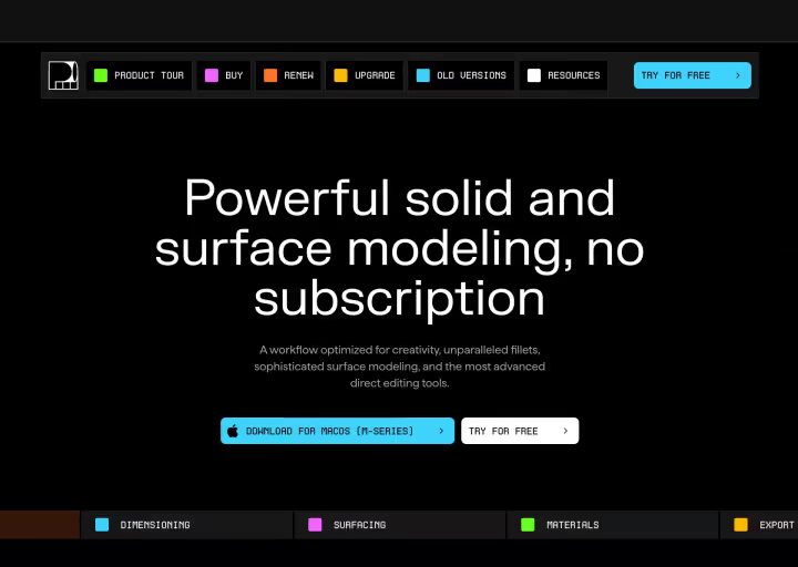
1. Factory

Factory's navbar is a masterclass in using contrast as a design tool. Against the dark, near-black background that spans the full page, each nav link sits inside its own bordered box — Pricing, Enterprise, Docs, Careers, News, Sign In — creating a segmented, almost keyboard-like row across the top right of the screen. The orange accent in the logo echoes the call-to-action color used further down the page, and the nav's typographic weight sits perfectly between the heavy hero text below and the delicate link labels.
What makes this navbar memorable is how intentional the bordered treatment feels. Most navbars let links float freely with whitespace as separator. Factory uses explicit boxes, which gives the nav a structured, technical quality that fits a developer-tool brand perfectly. Nothing about it is accidental.
What to take from this: visual treatments applied consistently to nav links can become a signature element of a design system. Borders, backgrounds, tags — anything that groups or frames a link differently from plain text adds a layer of brand personality that sticks.
View it on Navbar Gallery: navbar.gallery/navbar/factory
2. Pebble

Pebble's navbar is almost invisible, and that's entirely the point. A small logo mark sits in the upper left corner. In the upper right, a light pill-shaped container holds four plain links and a "Preorder" CTA, all set in a soft, warm typeface that blends with the muted outdoor photography filling the page behind it. Nothing competes with the hero. Nothing demands attention it hasn't earned.
This is a navbar that understands its role as supporting cast. The product is the visual story — a sleek electric camper van set against natural landscapes — and the navigation exists to let users move between pages without ever breaking that atmosphere. The pill container gives the nav just enough structure to be findable without asserting itself visually.
What to take from this: on visually rich, product-led sites, the best navbar is often the one that gets out of the way. Choosing a container shape, a light background, and a restrained typeface that harmonizes with the hero imagery is a design decision that takes real confidence.
View it on Navbar Gallery: navbar.gallery/navbar/pebble
3. Droppable

Droppable takes a different approach entirely: there is no traditional navbar at all. Instead, a pricing panel floats in the top right corner of the page, functioning as both the primary navigation destination and an immediate conversion surface. Two tiers, a download button, and a note about regional pricing — everything a first-time visitor needs to make a decision is right there on load, without requiring a single click.
It's a bold choice that only works because Droppable is a single-product app with one primary action: download. When your entire navigation can be collapsed into a single conversion-optimized panel, doing exactly that is a more honest design than building out a navbar with links that would largely go unused.
What to take from this: for single-product tools where the goal is conversion above everything else, a floating action panel can replace traditional navigation entirely. The "navbar" becomes the CTA. This approach works because it eliminates the gap between finding and deciding.
View it on Navbar Gallery: navbar.gallery/navbar/droppable
4. Jordan Gilroy

Jordan Gilroy's portfolio navigation sits vertically along the left side of the screen, numbered 01 through 04: INFO, WORK, ARCHIVE, CONTACT. A small purple square marks the active state on 01. On the right side of the screen, the designer's name, title, and a live date and time stamp sit in the top corners. The entire layout functions as a frame around the content rather than a traditional header.
This is one of the more compositionally daring approaches to static navigation in the collection. The vertical left-side placement is common enough in product dashboards but rare on portfolio sites, and here it creates a sense of page structure that makes the full-bleed photography and typographic content feel deliberately staged rather than simply scrollable. Every element has a precise spatial relationship with every other element.
What to take from this: navigation placement is a layout decision, not just a usability one. Vertical left-side nav, split corner placement, and centered floating navbars all create fundamentally different page compositions. For portfolio and creative sites, treating the navbar as a layout element rather than a utility opens up a much wider range of design possibilities.
View it on Navbar Gallery: navbar.gallery/navbar/jordan-gilroy
5. Nitta Studio

Nitta Studio's navbar lives at the bottom of the screen, centered, inside a small dark pill. Home, Craft, Writing sit alongside social icon links for Twitter, GitHub, Instagram, and email — all at the same visual weight, the social links represented by compact icons rather than labels. A "Last edited" timestamp floats to the right of the pill.
Bottom navigation is unusual on desktop web, and here it feels entirely intentional. The page is a personal site and web craftsmanship journal, and the nav placement mirrors the tab bar conventions of native apps, which makes sense given the creator's focus on the intersection of web and product design. The timestamp detail is a particularly nice touch — it communicates freshness and care without needing a separate "last updated" notice buried in a footer.
What to take from this: unconventional placement can be a statement about what the site is and who made it. A bottom-centered nav on a desktop site signals that the designer knows the rules well enough to break them intentionally. The key is that the placement feels purposeful, not arbitrary.
View it on Navbar Gallery: navbar.gallery/navbar/nitta-studio
6. Atoll Digital

Atoll Digital's navbar sits in the upper right quadrant of the page, not stretching the full width, just a compact row of three links and a language toggle. The left side of the viewport is dominated by the agency name in enormous black type, with the nav occupying only the space to its right. The result is a layout where the brand identity and the navigation share the same horizontal zone but feel like they belong to different compositional layers.
The small decorative icons before each link add a playful editorial quality that stops the nav from feeling too corporate, and the work link includes a count in parentheses — work(10) — which is an unusual detail that communicates portfolio depth without requiring a separate page to navigate to.
What to take from this: when your brand name is strong enough to anchor the layout on its own, you don't need the nav to span the full width. Constraining it to a portion of the header creates compositional tension that makes the overall design more interesting than a conventional full-width treatment would.
View it on Navbar Gallery: navbar.gallery/navbar/atoll-digital
7. Eisner and Co

Eisner and Co's navbar is centered, sits inside a bold red pill, and contains all-caps white link labels spaced evenly across the full width of the container. A logo mark anchors the left end of the pill and a chat icon sits at the right, giving the pill a clear directionality despite its symmetric layout. Against the light page background, the red pill is immediately the most visually dominant element above the fold.
This is a navbar that leads with brand confidence. Red is an unusual choice for financial institution design, where navy and grey are near-universal, and the centered pill placement reinforces the brand's position as something different within its category. The all-caps type treatment adds authority without stiffness.
What to take from this: color choice in a navbar isn't just an aesthetic decision — it's a positioning signal. A bold, unexpected color in a conservative industry communicates that the brand isn't playing by the same rules as its competitors. When used consistently across the navbar and UI, it becomes a brand identifier rather than just a design choice.
View it on Navbar Gallery: navbar.gallery/navbar/eisner-co
8. Lassco

Lassco's navbar is quiet and precise. Logo and wordmark on the left, four plain links on the right — Avantages, Produits, Equipe, Contact — all set in a clean sans-serif at a comfortable weight against a light header background. The dark diagonal cut at the bottom right of the header creates a bold graphic break between the nav zone and the hero image below, which is one of the more distinctive structural details in the collection.
What elevates this beyond a standard minimal navbar is that diagonal cut. It turns the header from a horizontal band into a shaped element, and it makes the transition from navbar to hero feel designed rather than incidental. The orange in the logo picks up again in the CTA button further down the page, creating a color thread that ties the nav to the rest of the site without requiring anything elaborate.
What to take from this: the shape of the header zone itself is a design variable that most sites never experiment with. A diagonal cut, a wave, a scalloped edge — any break from the standard rectangle immediately makes the nav area feel like it was designed rather than defaulted to.
View it on Navbar Gallery: navbar.gallery/navbar/lassco
9. Ribbit
Ribbit's navbar sits inside a small dark pill in the top left, containing four all-caps links and two circular elements that bookend the pill — one on each side. The rest of the viewport is open, airy, and given entirely to 3D characters and large editorial typography. The pill floats above it all without disrupting the layout.
What's notable here is how the navbar interacts with the 3D objects on the page. The characters and illustrated elements exist in the same visual layer as the content, and the nav pill floats in its own contained space above them. The effect is a page composition that feels more like a designed canvas than a traditional web layout. The animation that plays on the nav elements as the page loads adds to the sense that everything on the page — including the navigation — has been choreographed.
What to take from this: on creative and playful sites, the navbar can participate in the overall visual storytelling of the page rather than sitting above it as a utility. When the nav feels like it belongs to the same world as the content, the whole design coheres.
View it on Navbar Gallery: navbar.gallery/navbar/ribbit
How to Design a Static Navbar: Tips and Best Practices
Static navbars are deceptively simple. Because there's no interaction complexity to design around, all of the craft goes into the basics: layout, typography, spacing, color, and placement. Here's what the best examples above have in common and what you can apply to your own work.
Placement is a layout decision
Most designers default to full-width top-left logo, top-right links without questioning whether that's the right choice for the site they're designing. The examples in this roundup use centered pills, top-right clusters, vertical left-side columns, and bottom-centered bars. Each placement creates a different compositional relationship between the nav and the content below it.
Before committing to a placement, ask what the nav's relationship to the hero should be. Should it float above the content, frame it, anchor to an edge, or recede entirely? The answer shapes the placement, and the placement shapes the entire above-the-fold experience.
Visual treatment of links is underexplored
Plain text links are the default, but they're not the only option. Factory uses bordered boxes. Eisner and Co uses a full-color pill container. Atoll adds small decorative icons before each link. Ribbit bookends the pill with circular elements. Each of these treatments adds a layer of visual personality that distinguishes the nav from a default implementation.
The treatment doesn't need to be elaborate. Even a consistent hover state that feels deliberately designed, a small dot or line indicator for the active page, or a subtle weight shift on hover adds craft that attentive users notice.
Typography sets the tone before a word is read
The typeface used in a navbar communicates something before the user has read a single link label. Pebble's warm, rounded typeface signals approachability and nature. Factory's technical, monospaced-adjacent labels signal precision and developer credibility. Jordan Gilroy's uppercase tracking signals editorial confidence.
For static navbars, where the links are always visible, the typographic choice carries more weight than it does in a dropdown where the links are hidden until triggered. Choose a typeface that's legible at small sizes and that matches the overall brand voice, then set it with enough care that it feels intentional rather than default.
The CTA deserves its own visual language
Almost every navbar in this roundup treats the primary CTA differently from the navigation links. Pebble uses a slightly heavier weight and a clear visual separation. Factory uses a different background treatment for Sign In. Eisner and Co separates the chat icon spatially from the links.
This visual separation matters because the CTA has a different job than the navigation links. Nav links help users find their way. The CTA is trying to convert them. Giving the CTA a distinct visual treatment, whether through color, weight, a button container, or spatial separation, makes that distinction clear without requiring any explanation.
Sticky vs. static: make the decision deliberately
A static navbar that scrolls away with the page content is only the right choice when the page is short enough that the user will never need to navigate again after scrolling. On longer pages, a sticky navbar that follows the user provides a persistent wayfinding anchor that reduces friction.
The decision often comes down to how the site is used. Portfolio sites and landing pages where users move linearly through content can often afford a static navbar. Content-heavy sites, documentation, and long scrolling product pages benefit from a sticky implementation.
If you do make the navbar sticky, consider whether it should maintain the same visual treatment at scroll as it does at the top of the page, or whether it should collapse, gain a background, or change opacity as content scrolls beneath it. Many of the most polished navbar designs handle this transition deliberately rather than just leaving the nav as-is at all scroll positions.
Whitespace is the most underused tool in navbar design
The examples in this roundup that feel most refined share one characteristic: generous, deliberate whitespace around and between the nav elements. Link spacing, padding inside the nav zone, and the gap between the navbar and the hero below all contribute to whether the nav feels considered or crowded.
Tight spacing in a navbar communicates either density by necessity, as in a complex SaaS product with many destinations, or a lack of refinement. For most static navbars, erring on the side of more whitespace between links and more breathing room above and below the nav zone produces a result that feels more premium regardless of the rest of the design.
Navbar color and the page it lives on
A navbar doesn't exist in isolation. It sits above whatever the hero section is, and the relationship between the two is one of the most visible design decisions on the page. Lassco uses a diagonal cut to define the transition. Pebble uses a semi-transparent pill that lets the photography breathe beneath it. Atoll uses a light background that contrasts clearly with the large type beside it.
Consider what the hero is doing and design the navbar in response to it. A dark hero often benefits from a light or transparent nav. A light hero can support either. A full-bleed photography hero is usually best served by a navbar that feels as lightweight as possible, since the photography is the reason the user is engaged.
Common Static Navbar Design Mistakes
A few patterns come up consistently in static navbar implementations that undermine otherwise solid designs.
Defaulting to full-width without questioning it. Full-width navbars are a default, not a rule. For many sites, a constrained nav occupying only a portion of the header creates a stronger composition.
Treating all links equally. In most navigations, not all destinations are equally important. The primary CTA, the most visited page, and the secondary utility links all deserve different visual weights rather than identical treatment.
Ignoring the scroll transition. A navbar that looks great at the top of the page but becomes unreadable over mid-page content, or that gains a harsh white background on scroll without any softening, creates a jarring moment that interrupts the experience.
Choosing a typeface by default. The system font stack is not a navbar typeface. Setting nav links in the same typeface as body copy is a missed opportunity to give the navigation a distinct visual voice.
Not enough contrast in the active state. Users should be able to tell at a glance which page they're on. An active state that's only a few shades lighter than the inactive state fails that test. Make it obvious.
What These Examples Have in Common
The static navbars in this roundup look almost nothing alike, and that's the point. Factory's bordered boxes and Pebble's floating pill are solving the same problem in completely different ways, and both solutions feel exactly right for the site they live on. That's what good static navbar design looks like: not following a template, but making a set of deliberate decisions about placement, treatment, typography, and color that are specific to the brand and context.
The constraint of having no dropdowns or panels to hide behind is actually what makes static navbar design interesting. Every decision is visible all the time. That's what makes the craft worth caring about.


.png)