


Mega menus are one of the most powerful tools in a designer's navigation toolkit — and one of the easiest to get wrong. A well-executed mega menu can organize dozens of links without overwhelming the user, showcase rich visual content inside the nav itself, and become a signature part of a site's identity. A poorly designed one collapses into a cluttered wall of text that sends users straight to the back button.
This post rounds up the best mega menu navigation bar designs from across the web, with a look at what makes each one worth studying, plus a deep dive into the design decisions, patterns, and pitfalls that separate the ones that work from the ones that don't.
What Is a Mega Menu?
A mega menu is an expanded dropdown that reveals a large panel of content on hover or click. Unlike a standard dropdown that shows a simple vertical list, a mega menu can display multiple columns, feature images and icons, highlight calls-to-action, and group links into labeled categories — all within the nav itself.
They're most commonly used on sites that have a lot to say: SaaS platforms with multiple product areas, e-commerce stores with broad category structures, agencies with diverse service offerings, or any site where a standard dropdown would require too many levels of nesting.
The design challenge is real. More space means more decisions: how to group content, what to visually emphasize, how to keep it from feeling like a dropdown grew into a sitemap. The examples below all solve this in their own way.
When to Use a Mega Menu
Mega menus shine in specific contexts. They work well when:
- You have more than 6-8 primary navigation destinations
- Your content naturally groups into categories with subcategories
- You want to surface featured content, tools, or CTAs directly from the nav
- Your audience is likely to be returning users who benefit from a fuller view of what's available
They're generally overkill for simpler sites, portfolios, landing pages, and any context where a minimal nav is part of the brand identity. If you can fit your navigation into a standard dropdown without nesting more than one level deep, you probably don't need a mega menu.
Best Mega Menu Navigation Bar Design Examples
1. Outerbase

Outerbase uses a grid-based mega menu that balances visual hierarchy with density in a way that feels effortless. The panel combines smaller navigation links with two larger callout blocks, each featuring custom illustrations. The blurred background keeps the content from feeling like it's floating, grounding the menu against the page while still distinguishing it from the content behind.
What makes it work: the callout blocks break the monotony of a link list without sacrificing scannability. Your eye goes straight to the visual anchors, then moves naturally to the supporting links.
View it on Navbar Gallery: navbar.gallery/navbar/outerbase
2. Customer.io

Customer.io's mega menu is a masterclass in handling a large product suite without making users feel lost. Links are organized into labeled groups, each with a custom icon, and strategic callout sections point to the most important destinations. The structure accommodates a high volume of links while still feeling organized and even elegant.
What to take from this: iconography in mega menus pays dividends. Even simple, consistent icons next to link labels speed up scanning dramatically. Combined with clear grouping labels, you reduce the cognitive load of parsing a dense panel significantly.
View it on Navbar Gallery: navbar.gallery/navbar/customer-io
3. Vercel

Vercel's navigation is restrained by mega menu standards, but it's in that restraint that it excels. The expanded panel is clean and typographically precise, with sections separated by subtle visual cues rather than heavy dividers. It feels like it belongs to Vercel's design system completely — not like a menu that was added on top of the site, but one that grew out of it.
What to take from this: mega menus don't have to be visually complex to be effective. When your brand is built around precision and developer trust, a clean, well-spaced panel communicates competence better than a feature-rich one.
View it on Navbar Gallery: navbar.gallery/navbar/vercel
4. Doss
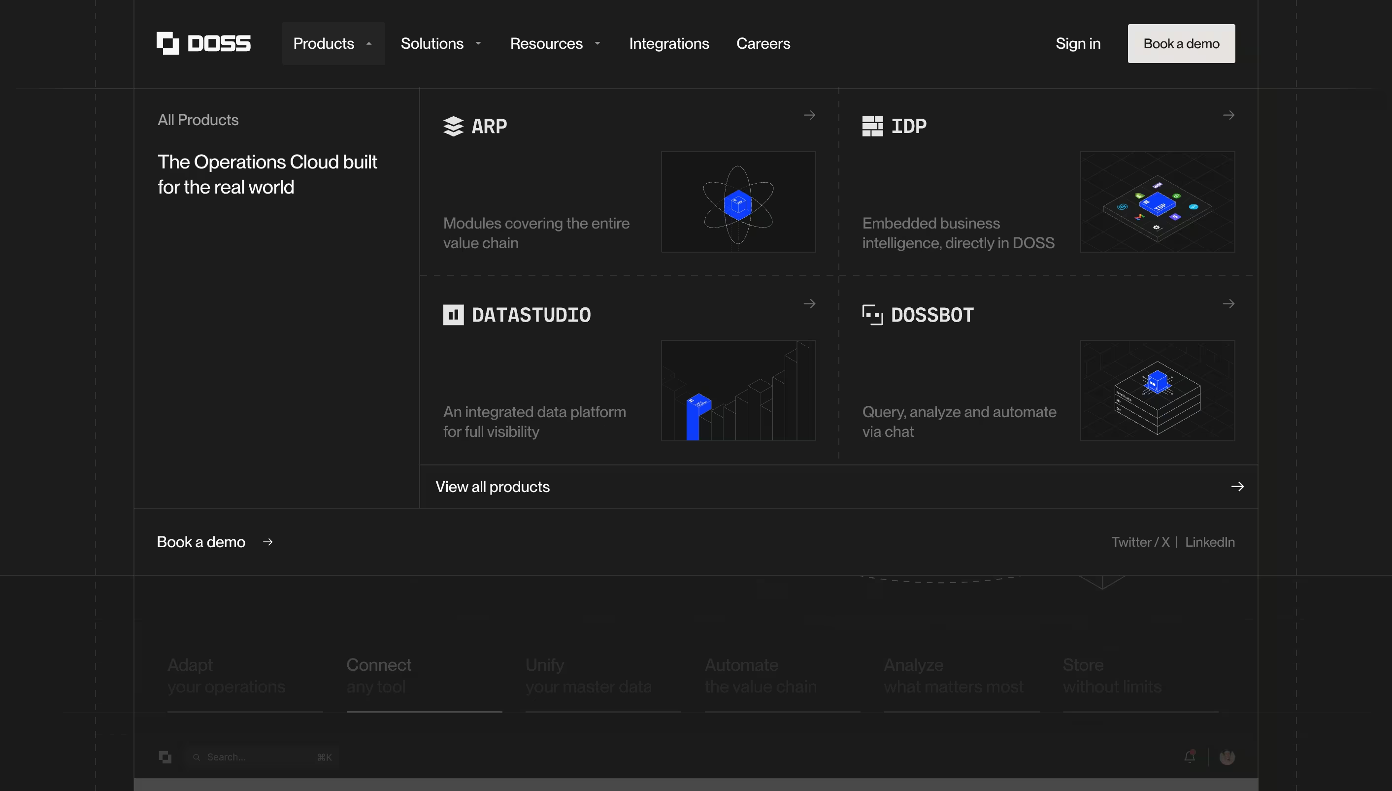
Doss’s mega menu tackles a complex, multi-faceted product with clear structure and hierarchy. Four labeled sections and a prominent “view all products” callout anchor the layout without competing with navigation. Thoughtful touches like dotted dividers organize content without adding visual weight, making a panel full of images, text, and logos feel instantly scannable.
What to take from this: the best mega menus are part of a broader design system. Doss shows what happens when the navbar gets the same craft as the rest of the site—no unnecessary animation or flashy callouts, just a hierarchy that makes a complex product feel approachable.
View it on Navbar Gallery: navbar.gallery/navbar/doss
5. Lattice

Lattice's mega menu does something most don't: it turns the nav panel into a content discovery surface. The layout splits into three distinct zones: a left column with top-level section links and short descriptions, a wide center section split into important links with icons and supporting copy, and a right column dedicated entirely to a featured piece of content.
What makes it particularly well-executed is that each zone has a job and stays in its lane. The left column orients you, the center lets you self-select by topic or format, and the right column gives you a reason to click even if you weren't sure what you were looking for. The descriptive subtext under every link is also worth noting, as it removes ambiguity without cluttering the layout, which is harder to pull off than it looks.
What to take from this: if your site has a content library, a resources hub, or any kind of editorial output, consider making the mega menu do promotional work rather than just organizational work.
View it on Navbar Gallery: navbar.gallery/navbar/lattice-2025
6. SurferSEO
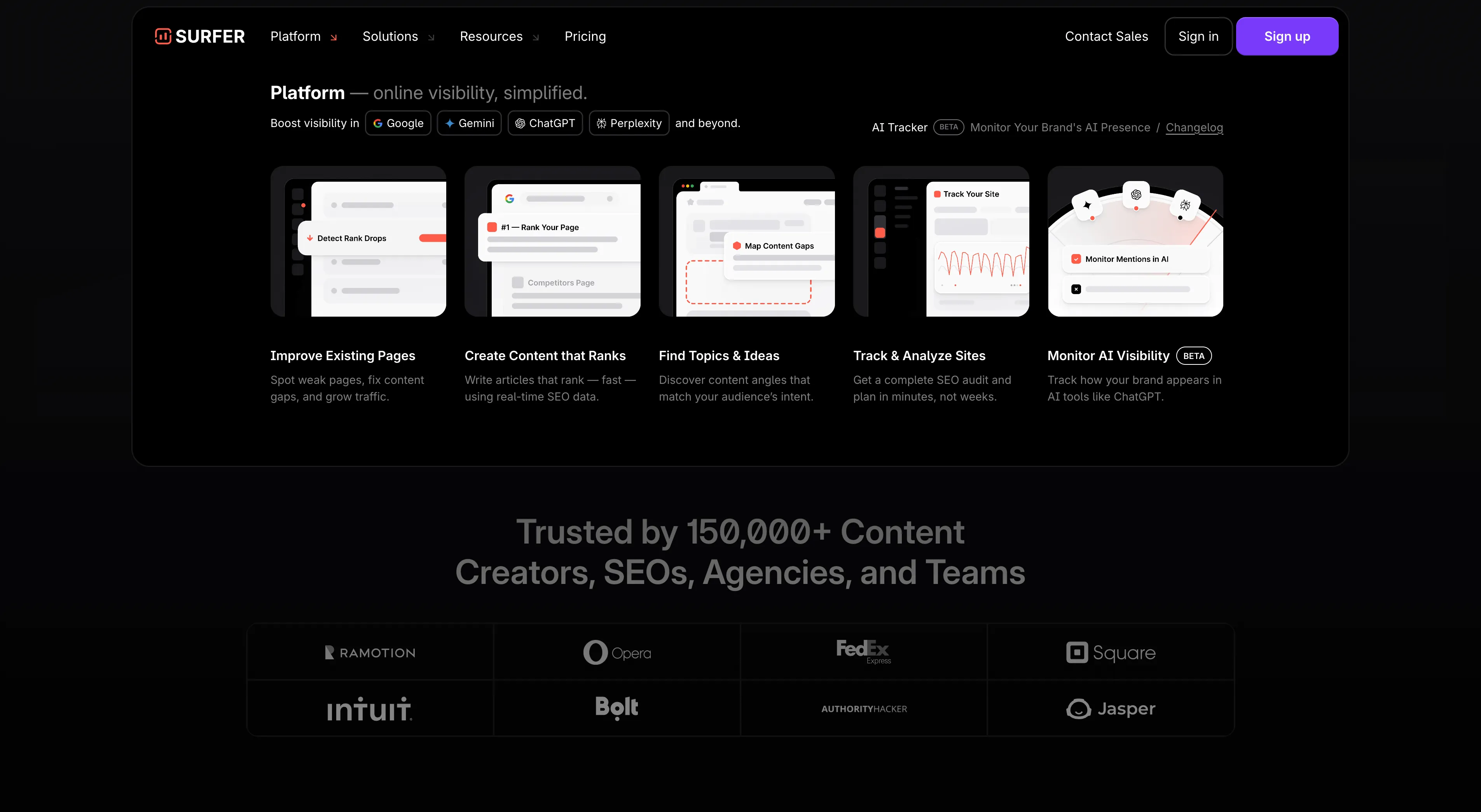
Surfer’s mega menu replaces the usual link list with five full product cards, each showing a mini UI preview, bold label, and one-line description. The panel opens on Platform and communicates the whole product at a glance with no nested links or categories to interpret. The dark background makes the light UI previews pop, so the menu feels more like a product overview page, which suits an SEO platform where prospects want to see the tool before a demo. A small line at the top reads “Boost visibility in Google, Gemini, ChatGPT, Perplexity and beyond,” and the AI Tracker beta feature gets a top-right callout, both smart uses of space that is often left blank.
What to take from this: a mega menu can do sales work; Surfer uses every hover on Platform to show the product, and the visual previews communicate value better than a list of feature names.
View it on Navbar Gallery: navbar.gallery/navbar/surferseo
7. Meter
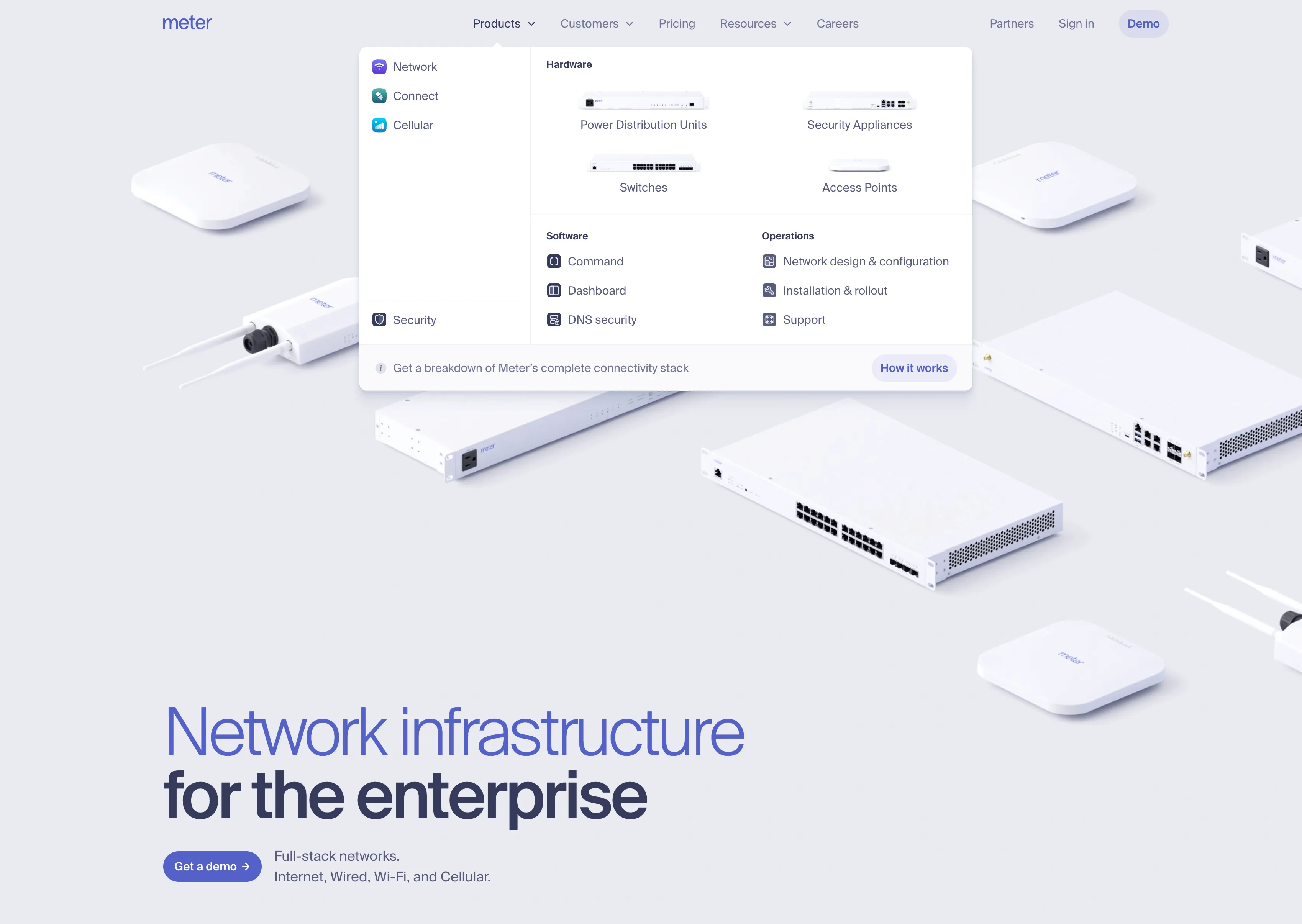
Meter's mega menu is a strong example of how to organize a hardware and software product under one roof without making the nav feel like a spec sheet. The panel splits into a left sidebar of top-level product categories, each with a distinct colored icon, and a right section that breaks down the selected category into three clear groups. Hardware items even get small product images instead of icons, which is an unusual and effective touch for a physical product company, as you see the actual switches and access points right inside the nav.
What to take from this: when your product spans both physical hardware and software, your mega menu architecture has to reflect that split clearly or users will get lost fast. Meter solves it by keeping the category sidebar as the primary selector and letting the content area respond to it, which is a pattern borrowed from OS-level navigation. The product images inside the Hardware section also do something no icon can: they make the product feel real and tangible before the user has clicked a single link.
View it on Navbar Gallery: navbar.gallery/navbar/meter
How to Design a Mega Menu: Tips and Best Practices
Studying examples is one thing. Understanding the underlying decisions behind them is what lets you apply those lessons to your own work. Here's a breakdown of the most important things to get right.
Start with information architecture, not visual design
The most common mega menu mistake is jumping straight into layout before the content is properly organized. A mega menu is essentially a compressed version of your site's full navigation structure, and if that structure isn't clear, no amount of visual polish will fix it.
Before touching your design tool, map out every link that needs to go in the menu. Then group them. Ask: what does a user expect to find next to what? A user looking for pricing should probably find it near plans and features, not buried after a list of integration partners. The groupings you land on become your columns, and your column labels become some of the most important text on the page.
Use visual anchors sparingly but deliberately
Featured blocks, callout cards, illustrations, and images all serve the same function inside a mega menu: they give the user's eye a place to land first. Every strong mega menu has one or two of these anchors.
The problem comes when there are too many. If three different sections each have a featured card, none of them are actually featured — they're just competing. The visual hierarchy collapses and the whole panel starts to feel like a landing page dropped inside a nav.
One strong callout, positioned intentionally, is almost always more effective than several moderate ones. Use it to highlight your most important CTA, your newest product, or the destination most first-time visitors should reach.
Treat column width as a hierarchy signal
Not all columns in a mega menu need to be equal width. Wider columns naturally draw more attention, so using column width as a hierarchy signal is a simple and visually clean way to communicate importance without relying on color or typography alone.
A common pattern: a wider primary column with major product areas on the left, and a narrower secondary column with resources, docs, or a featured link on the right. The user reads left to right, so they hit your most important links first, and the secondary content is there for users who want to go deeper.
Hover intent vs. click triggers
One of the more subtle decisions in mega menu design is whether the panel opens on hover or on click. Both are valid, but they create very different experiences.
Hover intent triggers
Hover-triggered menus feel fast and fluid. They suit sites where the nav is explored casually and repeatedly, like marketing sites and SaaS products. The tradeoff is accidental triggering when the user's cursor passes through a nav item on its way somewhere else, which can be jarring.
Click-triggered menus
Click-triggered menus are more deliberate. They suit product dashboards, e-commerce stores, and any context where the user has a specific intent in mind before they open the nav. They also work better on touch devices, where hover simply doesn't exist.
A well-designed hover-triggered mega menu includes a slight open delay (around 100-150ms) to prevent accidental triggers, and a "safe triangle" interaction model that keeps the panel open while the user's cursor moves diagonally from the trigger into the panel. Without a safe triangle, the panel closes the moment the cursor leaves the trigger element, which creates a frustrating gap in the middle of the interaction.
Animation: what to do and what to avoid
Mega menu animations are everywhere, and the best ones are almost invisible. The goal of a mega menu animation is to reduce the perceived abruptness of the panel appearing, not to draw attention to itself.
A simple fade-in combined with a subtle upward translate (2-4px) is one of the most reliable patterns. It feels smooth and polished without adding meaningful delay to the interaction. Some sites add a slight scale from 0.98 to 1.0, which creates a sense of the panel "expanding" naturally from the nav bar.
What to avoid: long durations. A mega menu animation that runs longer than 200ms starts to feel sluggish, especially for users who open the nav repeatedly. Also avoid entrance animations that move content from far away, flying in from the left or dropping down a full 20px tends to look more like a bug than an intentional design.
If you're building in Webflow, GSAP's ScrollTrigger offers excellent control over these kinds of interactions. For CSS-only implementations, a simple transition: opacity 150ms ease, transform 150ms ease on the panel element paired with a visibility toggle is usually enough.
Mega menus and SEO
Mega menus have a direct relationship with SEO that most designers don't think about. Google crawls the links inside your navigation, which means every link in your mega menu is a signal to Google about what pages on your site are most important.
This has two practical implications. First, every link in your mega menu that points to a key page gives that page an internal link from every single page on your site. That's significant PageRank passing. Links you bury in footers or secondary nav don't get that treatment. Be intentional about what you include.
Second, the anchor text of those links matters. "Learn more" or "Explore" is wasted anchor text from an SEO perspective. Descriptive labels like "Mega Menu Examples" or "Dropdown Navigation Design" tell Google what the linked page is about, which reinforces the keyword relevance of your target pages. This is one of the easiest wins in technical SEO and it costs nothing to implement.
Mega menu accessibility
Accessibility is where a lot of otherwise well-designed mega menus fall down. The main issues are keyboard navigation and screen reader compatibility.
For keyboard navigation, the minimum requirement is that every link in the mega menu is reachable by tabbing through the page. Beyond that, a well-implemented mega menu should open on Enter or Space when a trigger item is focused, and close on Escape. Focus should move into the panel when it opens, and return to the trigger when it closes.
For screen readers, the panel should use aria-expanded on the trigger element to indicate whether the panel is open or closed. The panel itself should use role="region" or be structured as a nav with a clear label. If your mega menu is purely CSS-driven with no JavaScript state, check that screen readers aren't announcing hidden links: links inside a display: none or visibility: hidden panel should not be reachable.
None of this requires a complex implementation. Most modern JavaScript mega menu patterns handle this out of the box. The ARIA spec has clear guidelines for disclosure navigation patterns, which is the pattern most mega menus follow.
Mobile: you need a separate strategy
A mega menu is a desktop pattern. On mobile, showing a full mega menu panel is almost never the right answer — the screen is too small to render a multi-column layout meaningfully, and touch targets inside a dense panel are often too close together.
The standard approach is a hamburger menu on mobile that opens a simplified version of the nav. The mega menu's grouped structure maps naturally to an accordion or a set of expandable sections on mobile, so you're not losing the organizational logic — you're just presenting it differently for the context.
The mistake to avoid is hiding the mobile nav as an afterthought after spending all your design energy on the desktop version. Users on mobile deserve the same quality of navigation experience, even if the pattern is completely different.

5 Common Mega Menu Design Mistakes
Even in strong design portfolios, a few patterns come up repeatedly as things that undermine otherwise solid mega menus.
- No visual grouping: A flat alphabetical list of 30 links inside a wide panel is not a mega menu — it's just a big dropdown. If you're not organizing content into labeled groups, you're missing the core function of the format.
- Too many featured elements: As mentioned above, featured cards and callouts lose their power when they're overused. Every "highlight" stops being a highlight when everything competes for the same visual attention.
- Inconsistent typography: Mega menus contain a lot of text at different hierarchy levels — group labels, link text, descriptions, CTAs. Sites that don't establish a clear typographic system for these levels end up with panels that feel visually chaotic even if the content itself is well-organized.
- Opening on hover with no delay: A mega menu that opens instantly on hover will trigger constantly as users move their cursors across the nav. A short delay (100ms) is almost always worth adding.
- Forgetting about keyboard users: This is the most common accessibility failure. Test your mega menu without a mouse before shipping it.
What All These Examples Have in Common
None of the mega menus in this roundup feel bolted on. They all feel like a natural extension of the site they live on, which is the real goal. A mega menu is a large, prominent surface area, and it sets the tone for what the rest of the site will feel like from the very first interaction.
The best approach is to treat the mega menu as a design project in its own right, not a navigation utility to ship and move on from. These examples prove that the investment shows.

.png)